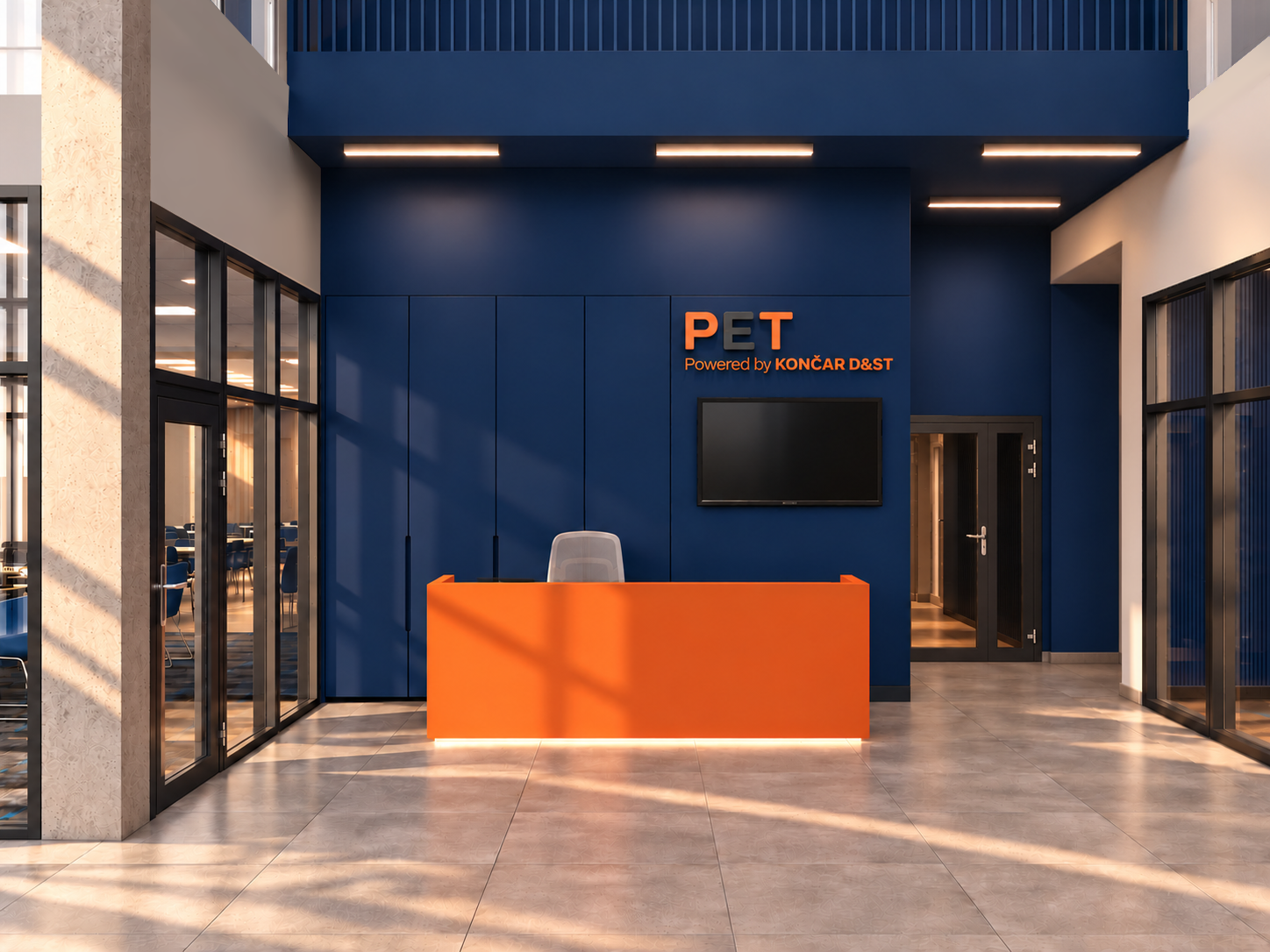
create a professional interior design material and color moodboard based strictly on the reference image of the kon ar d st office interior extract and present the existing materials finishes colors textures and material combinations visible in the reference image the goal is to communicate the interior design concept through a carefully curated material palette not to redesign the space color palette identify and accurately reproduce the dominant colors deep corporate navy blue used for seating and interior accents intense burnt orange terracotta orange used for cabinetry and feature surfaces warm grey and light beige grey used for flooring and neutral architectural surfaces brushed stainless steel and silver metallic tones white and off white tones used for tables ceilings and other neutral elements dark graphite and black used for selected details and framing maintain the original color relationships saturation and contrast do not shift the orange towards red or yellow or the navy blue towards purple or turquoise material selection create separate clearly visible material samples representing matte orange lacquered or finished cabinetry surfaces glossy orange ceramic wall tiles with visible grout lines vertically ribbed orange decorative panels brushed stainless steel cabinet fronts and metallic details light beige grey porcelain or stone look floor tiles with subtle surface variation matte navy blue seating upholstery navy blue painted or finished surfaces light neutral table surfaces white modular suspended ceiling panels dark metal details and black framing represent each material with realistic texture scale surface finish and natural light reflection clearly distinguish glossy ceramic matte painted surfaces ribbed panels brushed metal upholstery and stone look flooring moodboard composition arrange the samples in a clean sophisticated architectural presentation board use a neutral light grey or off white background balanced spacing and a clear visual hierarchy include a coordinated color palette with solid color swatches alongside the corresponding material samples use a combination of larger material samples and smaller complementary swatches present the materials as a curated professional interior designer s material board with realistic close up textures and subtle shadows the composition should feel contemporary energetic precise and industrially inspired reflecting the character of a modern engineering company strict requirements use only materials and colors supported by the reference image do not introduce wood marble brass gold additional accent colors decorative objects furniture arrangements or materials that are not visible in the reference do not create a new interior visualization do not alter the original color palette or invent new finishes output a polished photorealistic architectural material and color moodboard suitable for a professional client presentation