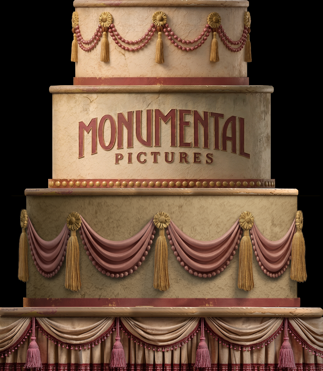
paint elevation refinement not a photorealistic render preserve the source image exactly in geometry proportions silhouette tier heights molding profiles trim placement ornament placement drapery shapes tassels beadwork lettering and composition do not redesign add remove reposition resize smooth or reinterpret any element transform the existing treatment into a cohesive professional theatrical paint elevation for a fabricated 1920s hollywood movie prop cake the image should communicate the intended colors materials scenic painting decorative details and aging clearly enough for a scenic artist to reproduce rather than looking like a photorealistic finished object maintain all existing colors with maximum precision preserve the current warm cream dusty rose muted burgundy red champagne gold and aged neutral palette do not recolor or introduce new hues instead make the existing colors feel more deliberately coordinated across the entire elevation reduce the ai generated appearance remove random micro detail arbitrary scratches fake cracks inconsistent grunge muddy textures hyper detailed material noise overly perfect repeated ornament plastic looking fabric excessive dimensionality and inconsistent rendering styles replace these qualities with controlled theatrical scenic paint texture broad subtle mottling restrained stippling gentle scumbling softly painted aging simplified highlights and intentional hand painted variation surface texture should be visible enough to communicate a paint treatment but remain broad and readable from a distance treat the cream cake surfaces as painted theatrical scenery not real frosting stone or plaster use warm ivory scenic paint coloration with restrained mottling and subtle tonal variation treat the gold decoration as painted or theatrical metallic gold detailing using the existing champagne brass gold color avoid highly realistic metallic reflections use simplified painted highlights and shadows to communicate dimensional ornament treat the dusty rose swags bead strands tassels fringe and skirt as clearly readable paint elevation representations of fabric and trim retain their folds and dimensional information but simplify the shading avoid photographic fabric highlights and deep cgi style shadows preserve monumental pictures exactly same lettering arc proportions spacing placement red coloration and gold edging clean and unify its treatment with the rest of the elevation without changing the typography use flat controlled front elevation lighting minimize realistic directional lighting dramatic highlights ambient occlusion cast shadows deep contact shadows and photographic contrast use only enough painted light and shadow to explain form folds molding and dimensional ornament the entire object should have one consistent scenic art language the top bead swags logo tier large fabric swags moldings tassels decorative bands and bottom skirt should look as though they were developed together by one scenic designer and painted by one scenic shop strict precision maintain source geometry 100 maintain silhouette 100 maintain proportions 100 maintain ornament locations 100 maintain typography 100 maintain existing colors with maximum precision maintain the orthographic front elevation maintain the black background do not redesign do not make more ornate do not add decoration do not change the palette do not introduce perspective final appearance a polished theatrical paint elevation unified intentional slightly hand painted period appropriate clearly readable and less ai generated with flatter and more controlled lighting than a photorealistic render