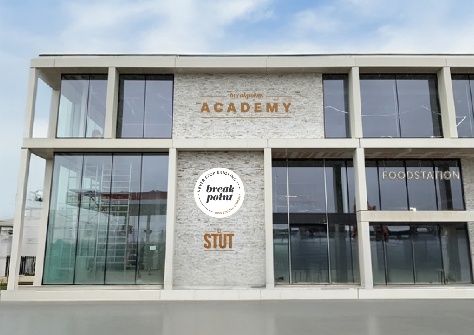
keep the exact same facade and composition correct the vertical perspective so the building appears perfectly straight and architecturally aligned modify only the copper letters academy and the small top script the letters are 3 mm ultra thin brushed copper plate letters visually almost flat to the facade no visible side faces no projection shadows only a very soft subtle contact shadow directly behind the letters the letters should read almost like precision cut copper sheets mounted to the wall use refined brushed copper with soft elegant reflections and balanced exposure add subtle high end architectural atmosphere slightly warm late afternoon daylight soft gradients gentle ambient light do not modify the round logo the round copper circle must remain exactly as it is unchanged in thickness material lighting and position thick extrusion visible side faces deep shadows heavy drop shadow industrial signage dramatic lighting wide angle distortion modification of the round logo