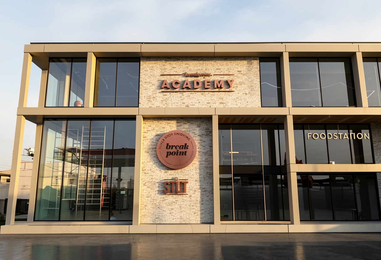
keep the exact same image camera angle and lighting refine only the copper letters academy and the small script above reduce the thickness of the letters so they appear slimmer and more refined approximately 5 8 mm thick the extrusion should be subtle and elegant not bulky soften the cast shadows behind the letters reduce shadow contrast and make the shadow edges more diffused the letters should feel premium and architectural with lighter visual weight keep the brushed copper material realistic with soft reflections do not modify the round logo facade or any other elements negative prompt thick block letters heavy extrusion dark hard shadows industrial look dramatic contrast modification of the round logo