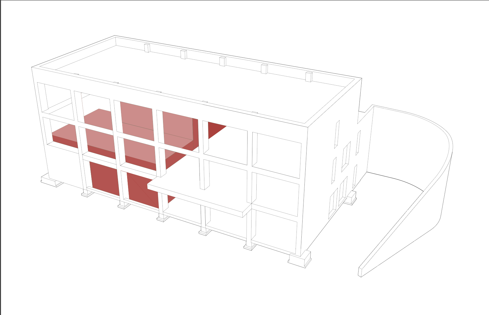
add a second distinct grey tone to emphasize the structural support columns as part of the building s structural grid keep every existing column in its exact original location shape size and proportion do not add remove or move any columns use a medium dark neutral grey for the existing support columns making them visually distinct from the lighter grey architectural shading the columns should read as a continuous structural grid system visually connecting the vertical supports across the facade and interior the structural columns should have consistent tonal treatment throughout the building regardless of whether they are in shadow use the darker grey as a graphic architectural convention rather than realistic lighting keep the existing red highlighted surfaces unchanged keep the lighter grey shading on floors walls recesses and undersides preserve all original linework geometry perspective proportions openings slabs foundations and site elements color hierarchy white primary background surfaces light grey architectural shading and depth medium dark grey structural support columns grid red existing highlighted surfaces black thin grey lines original drawing linework the result should remain a clean minimal architectural diagram not a photorealistic rendering i d make the hierarchy something like this element treatment purpose red surfaces existing red primary program element being highlighted structural columns medium dark grey shows structural grid floors slabs light grey shows horizontal organization recessed spaces light medium grey shows depth deep shadows medium grey creates spatial depth linework original defines geometry one important trick tell archsynth that the columns should be shaded uniformly rather than according to the light source otherwise it may make some columns dark and others light which weakens the idea that they are one structural system