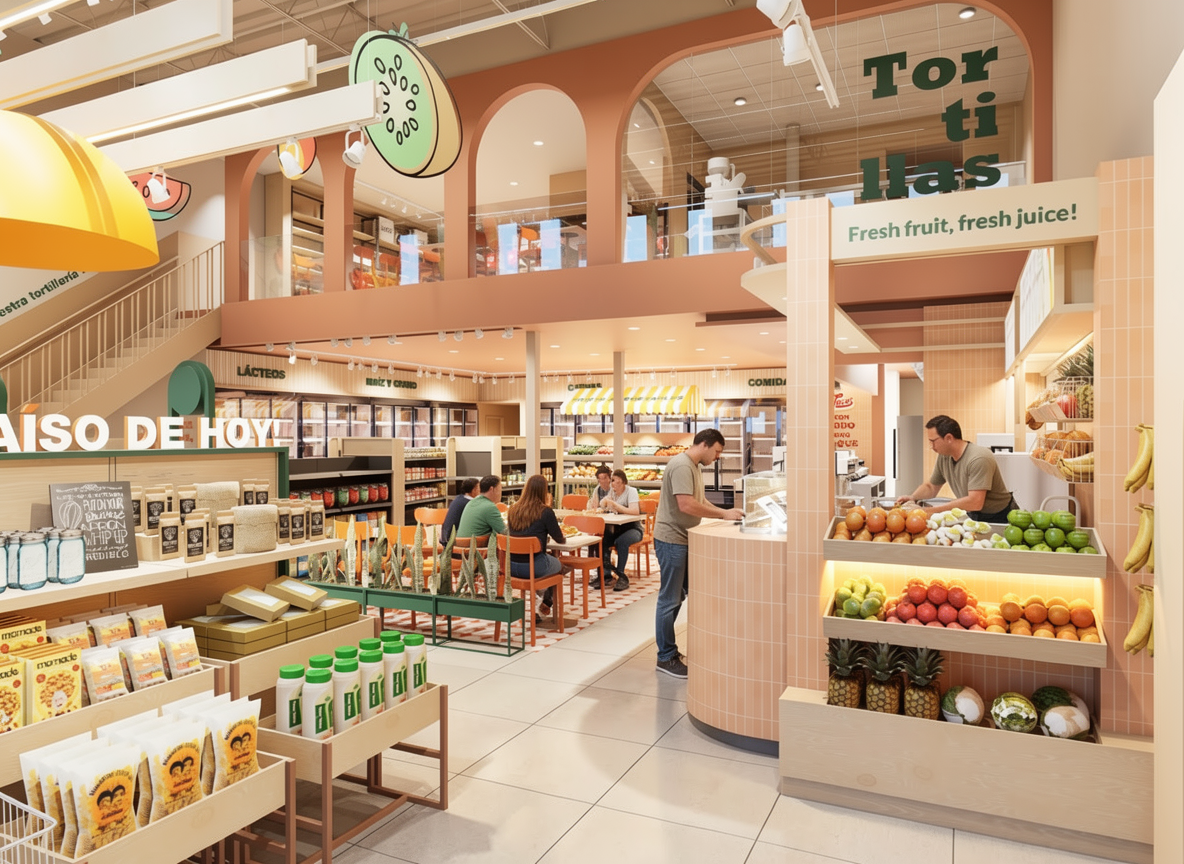
recolor this retail interior render to create a bold high contrast tropical latin market atmosphere using the para so tropical brand colour palette keep the architectural geometry furniture layout lighting positions and camera angle unchanged only modify materials finishes and colour application colour application strategy architectural arches structural frames replace existing peach tones with deep green pantone 561c 00594c in a matte painted finish feature walls vertical planes introduce medium tropical green pantone 7724c 00966c on selected focal walls to create layered contrast juice bar service counter apply tropical orange pantone 144cp f7911d to vertical cladding panels or tile surfaces integrate yellow pantone 7549cp fdb200 as accent trims or canopy elements signage graphic elements use vibrant red pantone 1788c ea1d33 selectively in branding graphics and typographic highlights to create visual punch seating loose furniture accents introduce controlled pops of yellow and red for contrast while keeping balance millwork shelving maintain light natural wood texture for warmth but reduce beige and desaturated tones in surrounding finishes increase colour saturation and contrast overall reduce neutral dominance keep warm ambient lighting but enhance vibrancy so fruits and fresh products look vivid and fresh the final environment should feel energetic joyful contemporary tropical and visually impactful a colourful latin retail destination with strong brand identity and high contrast