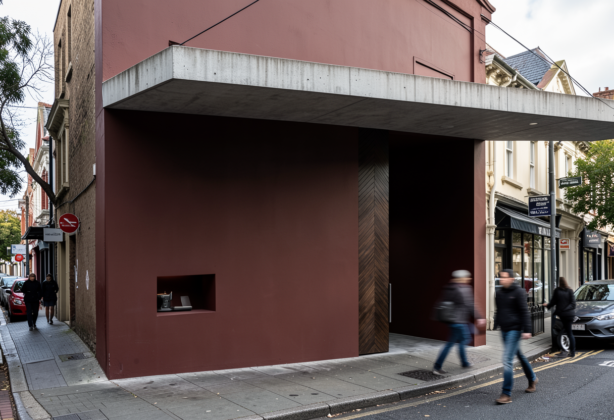
can you brigten this up and have the view be from a person on the path closer to thestore front and can you add neighbours neighbouring store left tradition appears as a small independent boutique with a slightly cluttered window display branding is bold but not refined repeated signage inconsistent placement interior looks dense and product heavy lacking spatial curation visual identity leans more commercial than experiential overall feel approachable but not elevated or immersive neighbouring store right more minimal storefront but still conventional large glass frontage with standard retail display mannequins interior lighting is even and functional not dramatic a hint of personality neon signage inside but still reads as generic boutique retail overall feel clean but lacks narrative or depth