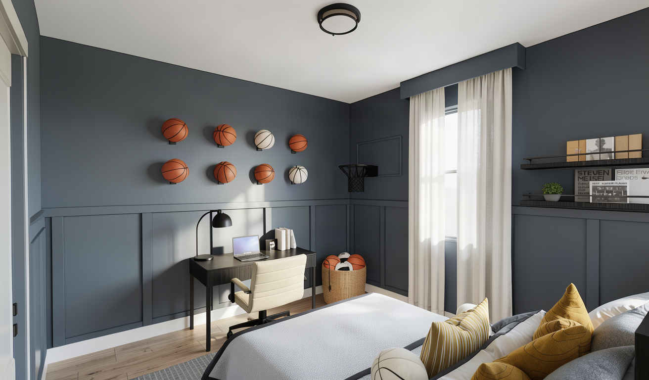
keep this render exactly as it is but adjust the overall lighting and color grading to match the approved front view reference more closely the current image is too muted beige and desaturated make the image slightly brighter fresher and more vibrant while preserving a sophisticated warm neutral atmosphere use clean natural daylight with soft warm highlights balanced neutral whites and slightly stronger contrast avoid an overall yellow beige sepia or gray cast the sherwin williams downing slate sw 2819 walls must remain rich and clearly blue gray as in the approved front view reference keep the warm caramel and mustard accents vivid and elegant without oversaturation whites and creams should look clean and luminous not yellow match the approved front view reference as if both images were photographed during the same session with the same white balance exposure contrast and color grading also match the bedding exactly to the approved front view reference remove the brown caramel throw and preserve the gray textured bedding charcoal trim layered white and gray pillows mustard striped pillows cream knot pillow and orange basketball pillow do not change anything else