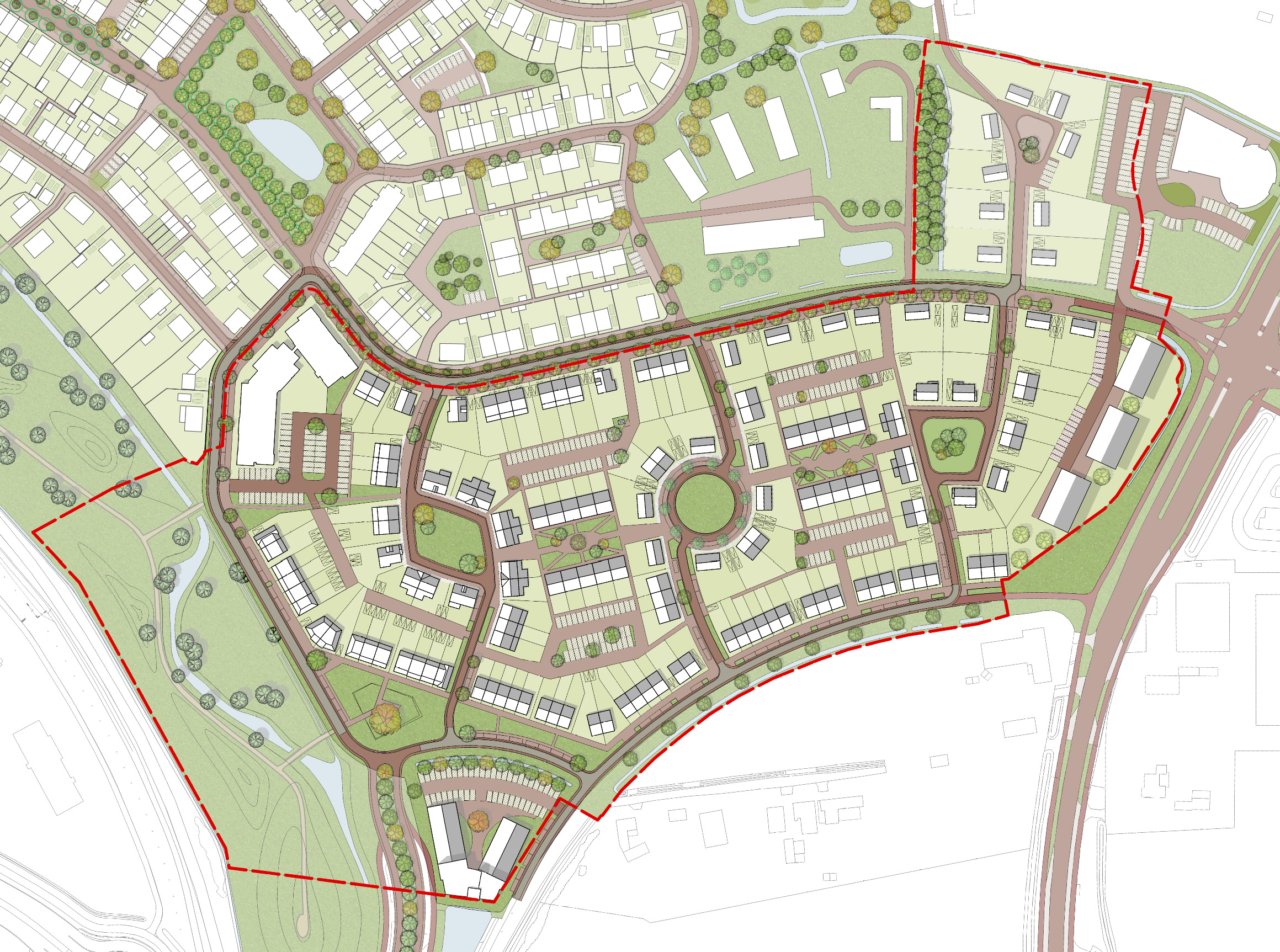
transform the input image into the same hand rendered plankaart landscape masterplan style as the provided reference image critical instruction this is a graphic style transformation of an existing plankaart do not redesign the plankaart do not interpret the plankaart do not improve the plankaart do not complete the plankaart do not add any content do not remove any content do not move any content do not change any geometry the input image is the absolute content master the reference image is the absolute style master the input image determines exactly what is shown the reference image determines only how it is drawn think redraw this exact plankaart by hand in the graphic style of the reference image not design a new plankaart based on this image 1 exact plankaart preservation preserve the input plankaart as accurately and literally as possible keep exactly the existing building footprints building shapes building positions roads paths streets sidewalks courtyards gardens planting areas trees vegetation water parking open spaces site boundaries property boundaries landscape structures circulation spatial relationships distances proportions orientation composition the geometry must remain unchanged do not redraw the project into a different layout do not straighten geometry do not regularize geometry do not simplify geometry do not move objects do not resize objects do not reinterpret ambiguous areas 2 absolutely no new content this is extremely important do not add anything that is not already visible in the input plankaart do not add trees shrubs planting buildings structures roads paths furniture cars people parking spaces gardens water landscape elements architectural details decorative elements do not fill empty areas do not make the landscape look more complete do not use the reference image as inspiration for additional content if something is absent in the input image it must remain absent if an area is empty in the input image keep it empty if there are only a few trees in the input image keep only those trees if there is no planting in an area do not add planting there 3 absolutely no content removal do not remove existing elements do not clean up the plan do not simplify the plan do not erase small elements do not remove existing trees paths buildings or landscape elements every visible element in the input should remain present in the final image 4 plankaart composition maintain the exact composition of the input plankaart keep same viewpoint same top down orientation same framing same scale same proportions same object positions same spatial relationships do not crop differently do not zoom do not rotate do not introduce perspective do not turn the plankaart into an aerial photograph the final image must still read clearly as the same plankaart 5 reference image style only use the reference image only for its graphic appearance copy its visual softness colour language linework watercolour technique pencil technique vegetation drawing style building representation graphic hierarchy transparency contrast paper appearance overall atmosphere do not copy its content do not copy its buildings do not copy its trees do not copy its roads do not copy its landscape layout do not copy its composition the reference image is a style template not a design template 6 hand rendered plankaart style the final image should look like a high end european landscape architecture competition plankaart it should look hand rendered using fine graphite pencil delicate coloured pencil very thin pale grey linework diluted watercolour subtle pigment variation soft paper the drawing should be very light airy delicate quiet refined precise translucent softly coloured architectural hand rendered the colours should remain soft and muted but still clearly visible do not make the image excessively white or washed out do not create a strong white haze over the entire image the image should retain enough colour and tonal variation for the different elements of the plankaart to remain clearly readable the final result should feel like a carefully hand drawn architectural landscape plan on paper it must not look like a digital render it must not look like a photograph it must not look like a photorealistic visualization 7 colour palette use the same soft refined and desaturated colour language as the reference image the colours must be gentle muted and elegant however the colours must remain clearly visible do not wash the colours out until they become almost white do not cover the image with an excessive white haze do not make the image overexposed the colour treatment should have a balanced relationship between soft pastel tones and clear readability dominant warm white soft ivory very pale warm grey landscape soft sage green muted sage green soft grey green muted olive green the landscape greens should remain soft and desaturated but clearly recognizable as green trees pale sage soft grey green very pale olive trees should remain soft and translucent while still being clearly visible buildings all buildings must be white buildings must be represented only with clean white soft white warm white very pale ivory buildings should remain the lightest major elements in the image do not make buildings green do not make buildings beige do not make buildings yellow do not make buildings pink do not make buildings blue do not introduce coloured fa ades do not introduce colourful building materials buildings should read as simple clean white architectural masses within the landscape roads and paths very pale warm grey soft neutral grey light grey roads and paths must remain clearly visible and distinguishable from the white buildings and landscape they should not disappear into the white background water extremely soft pale blue grey very pale muted blue grey water should remain subtle and desaturated but still clearly recognizable as water small accents faded beige soft ochre extremely subtle dusty pink muted yellow use these accents only where they correspond to existing elements in the input image all colours must remain soft and understated the desired colour balance is soft colours clear colour visibility low saturation good plankaart readability do not make the image vivid do not make the image colourful in a strong or saturated way do not make the image dark do not make the image overly pale no vivid colours no highly saturated colours no bright green no dark green no strong blue no pure black no excessive white haze 8 plankaart linework maintain precise architectural linework use fine graphite fine pencil very thin technical pen pale grey linework building outlines paths roads and boundaries should remain readable however all linework should remain delicate and low contrast linework should resemble a refined hand drawn architectural drawing rather than a digital vector drawing do not create thick outlines do not create black outlines do not create bold vector graphics do not create heavy technical drawing do not create exaggerated graphic borders 9 buildings keep the exact buildings from the input image do not change their shape footprint size position orientation all buildings must be white represent them as very light clean architectural masses use only warm white soft white very pale ivory extremely subtle pale warm grey edge definition buildings should remain visually light and simple do not add coloured fa ades do not add coloured materials do not introduce green blue yellow pink or beige to the building surfaces minimal architectural detail do not invent windows fa ades roofs or materials that are not visible in the input do not change the architectural design do not make buildings photorealistic do not create realistic glass do not create realistic concrete do not create realistic brick do not create realistic reflections the buildings should look like clean white architectural masses in a hand rendered landscape architecture plan 10 existing trees only only render trees that already exist in the input image do not add trees transform existing trees into the delicate hand rendered style of the reference use soft organic canopies pale sage grey green pale olive subtle translucent pencil marks soft watercolour trees should have a hand drawn appearance they should remain illustrated rather than realistic trees must be clearly visible while remaining soft and delicate no photorealistic trees no 3d trees no realistic foliage no dark foliage no photographic tree textures 11 landscape and planting only represent landscape and planting that already exists in the input do not invent planting do not increase vegetation density do not create new landscape areas use soft translucent sage and grey green watercolour landscape areas should remain clearly visible do not turn existing landscape into a white or nearly white surface maintain subtle but readable colour differences between landscape areas allow white paper to remain visible but do not allow the entire image to become washed out the landscape should feel soft hand painted and refined it should not look realistic or photographic 12 roads and paths keep the exact existing road and path geometry represent them using soft but clearly visible pale warm grey keep them visually quiet and understated roads and paths should remain readable against the landscape do not create realistic asphalt do not create realistic pavement textures do not create photographic surfaces do not add road markings that are not present do not make roads dark do not turn roads into black or realistic asphalt surfaces 13 no photorealism the final result must never look photographic this is not a photorealistic image this is not a 3d visualization this is not a cgi render this is not an aerial photograph this is not a drone photograph this is not satellite imagery the final result must look like a hand drawn architectural landscape plankaart no photorealism photography aerial photography drone photography satellite imagery cgi 3d rendering photorealistic vegetation photorealistic trees photorealistic buildings realistic building materials realistic pavement realistic asphalt realistic reflections hdr cinematic lighting glossy rendering dramatic lighting photographic textures avoid any visual treatment that makes the image look like a photograph or realistic architectural visualization 14 lighting and shadow use very soft diffuse almost paper like illumination shadows should be extremely subtle do not introduce dramatic shadows do not create shadows that imply objects that do not exist no cinematic lighting no hard shadows no deep shadows no dramatic sunlight no strong directional lighting the image should remain bright and calm however do not overexpose the image do not create a white haze that removes the colour from the plankaart maintain enough tonal variation for all existing elements to remain readable 15 series consistency this image belongs to a series of plankaarten every image must use exactly the same visual language use the same colour palette colour softness saturation brightness colour density line weight watercolour softness pencil texture tree style building treatment white building colour road and path treatment water treatment shadow softness paper appearance the images should look as if the same landscape architect drew every plankaart by hand using the same materials on the same paper the style stays constant the content changes only according to the individual input image do not reinterpret the style for different input images do not make one image photorealistic do not make one image more saturated do not make one image darker do not make one image excessively white do not make one image more colourful than another maintain a consistent visual identity across the complete series final absolute rule content 100 from the input plankaart style 100 from the reference image do not add do not remove do not move do not redesign do not invent do not complete do not interpret only translate the existing plankaart into the visual style of the reference the final result must look like the exact same plankaart was redrawn by hand in the style of the reference image final visual priority buildings white landscape soft muted and clearly visible trees soft sage grey green and clearly visible roads and paths soft pale grey and clearly visible water soft pale blue grey and clearly visible planting soft muted and clearly visible linework fine delicate and pale grey overall image soft hand rendered architectural desaturated and refined the image must not be photorealistic the image must not look like cgi the image must not look like a 3d render the image must not look like a photograph the image must look like a carefully hand rendered european landscape architecture plankaart the buildings must remain white the colours must remain soft and muted the colours must still be clearly visible and distinguishable do not create an excessive white haze do not wash out the landscape do not make the colours disappear maintain a delicate balance between soft pastel colour and clear architectural readability most importantly the content and geometry remain exactly the same the buildings are white the colours are soft but clearly visible the result is a hand drawn plankaart not a photorealistic image