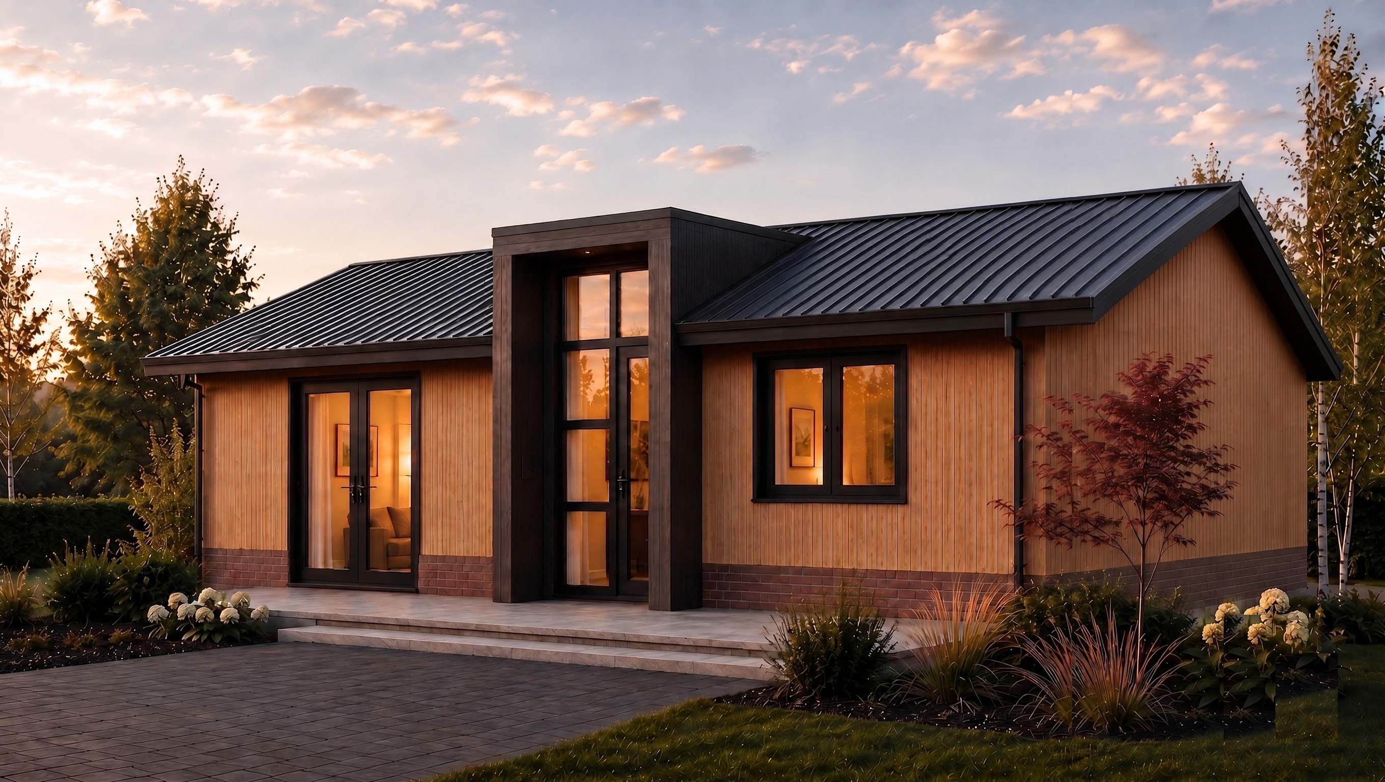
using this exact image correct the color palette to match the reference photo precisely this is a color only correction do not change geometry composition or camera angle problem 1 main wall cladding is too orange saturated currently the main wall cladding weissbach eiche vinylit is too warm orange and overly saturated change it to a lighter more muted honey beige golden tan tone softer and paler than the current color matching the lighter less saturated warm oak tone shown in the reference photo problem 2 entrance bay has an incorrect lighter frame currently the entrance bay has a lighter brown grey brown wood frame or border around the dark cladding panel creating a two tone look this is incorrect in the reference photo the entire entrance bay including its outer edges and frame is a uniform solid dark charcoal near black color kitami oak with no lighter trim or frame breaking up the dark surface remove the lighter toned frame border and make the entire entrance bay volume one consistent uniform dark near black tone matching the strong high contrast dark tone shown in the reference photo goal the final color contrast should match the reference photo light muted honey beige main walls against a strongly contrasting uniformly dark near black entrance bay with brick base tones unchanged do not change building geometry proportions roofline or the flush non projecting entrance bay position window and door design and positions brick base color and texture already correct roof material color or the 30cm overhang landscaping sky lighting mood or camera angle this is purely a targeted color correction on the two elements described above